Previous Icon
![Meteor Education Old Logo Design]()
Icon Refresh
![Meteor Education Refreshed Logo Design]()
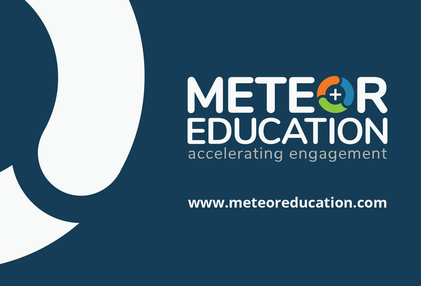

Meteor Education Refresh
Full Brand & Style Guide Refresh
Designer & Idea Brewer
Overview
Originally established as a furnishing provider exclusively serving schools in Florida, Meteor Education has undergone a transformative journey, emerging as one of the leading national providers of educational learning spaces. With a steadfast commitment to integrating best practices in teaching and learning, the organization focuses on fostering inquiry-based instruction, optimizing the utilization of modern classrooms, and enhancing student achievement across the nation.
Key Objective
Under the previous name Contrax Furnishings, Meteor Education underwent a significant rebranding in 2016 to better reflect its expanded role as a comprehensive educational provider. The new name, Meteor, encapsulates the organization's core pillars of methods, tools, environments, and relationships. While the brand identity was significantly improved from Contrax Furnishings, I recognized an opportunity to enhance the new brand appeal further by introducing a more contemporary and refined aesthetic.
Challenge
The primary hurdle in this brand refresh project revolved around convincing the board of directors and key stakeholders of the company to embrace the proposed changes. Through persistent pitching and numerous meetings, I strategically showcased the areas that required modification and outlined the intended improvements. As the board witnessed the initial design and brand updates, their confidence grew, ultimately granting me full ownership of the project.
Solution
For this project, my strategy was to leverage my extensive 15-plus years of design experience, with a specific emphasis on minimalist design principles. The objective was to streamline the branding package by removing unnecessary clutter and superfluous design elements, resulting in a sleek and modern aesthetic. By reimagining the brand icon, I eliminated extraneous dots and introduced a captivating "cut-out" effect between the semi-circles, imbuing the icon with a sense of motion. This alteration sparked upper management's inspiration, leading to a revision of the tagline from "connecting the dots" to "accelerating engagement." Additionally, I softened the edges of the plus sign within the icon, opting for a more inviting appearance, selected a cleaner and rounded font, and introduced brighter, more vibrant brand colors to replace the muted palette of the previous version.